Project Three: Behavior Dashboard
Where: FACTS SIS (school information system)
Audience: School administrators
Goal: To provide our users with visual representations of their school’s behavior data for reporting and other administrative needs.
Additional project notes:
These data visualization dashboards are a new feature to our SIS.
The dashboards are being created in Power BI — an entirely new tool for everyone on the project with its own unique design constraints.
My role: I designed data visualization dashboards from the ground up to present relevant information about school behavior patterns to our administration users.
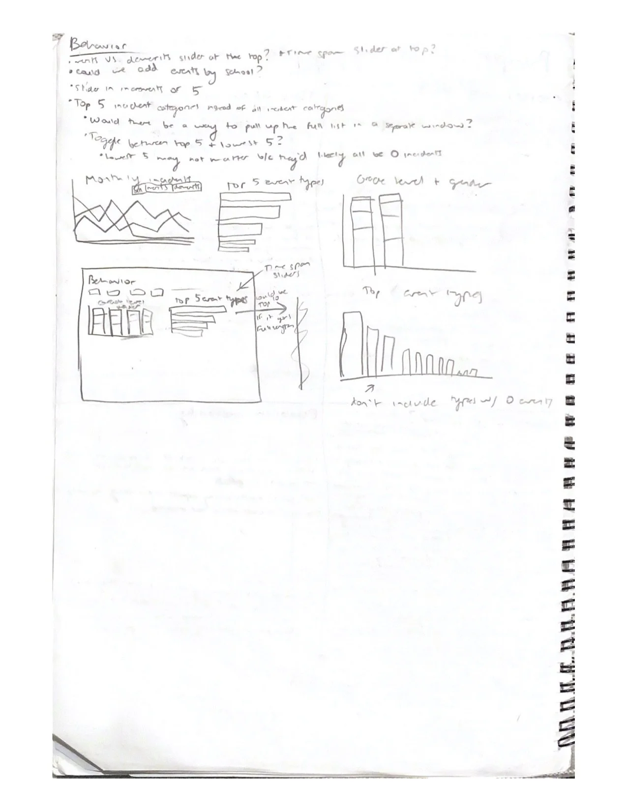
Initial Discussion & Sketch
After receiving the project goal from my product owner, I got to work drafting up a series of data visualizations that would best achieve this goal. Many visualizations were also directly requested by the product owner.
Encountered problem: I realized that our system recorded two different types of behavior events: merits and demerits. If we included both of these when reporting on behavior “incidents” (which is connotatively associated with negative events), the data would be skewed by the positive events.
Solution: Separate merit and demerit data (later renamed to “infractions”) via tabs in at the top of the dashboard.
Including Accessibility
A passion of mine with product design is digital accessibility. It was really important to me that our data visualizations would be meaningful to our colorblind users (which we do have). To achieve this, I had to make sure information was conveyed by color alone by doing the following:
Labels were added directly to the pie charts to remove the use of a color-dependent legend.
White lines were added between pie chart wedges to clearly separate them and prevent colors from “blurring,” especially if a user (even users who can see full color) do not experience eye strain from staring at the page for an extended period of time.
The lines on the line graph would use different patterns so the legend was not entirely color-dependent. This way, the lines were still distinguishable by a colorblind user.

Behavior Dashboard in red-green colorblindness view. Generated by COBLIS (Color Blindness Simulator)
Final Dashboards
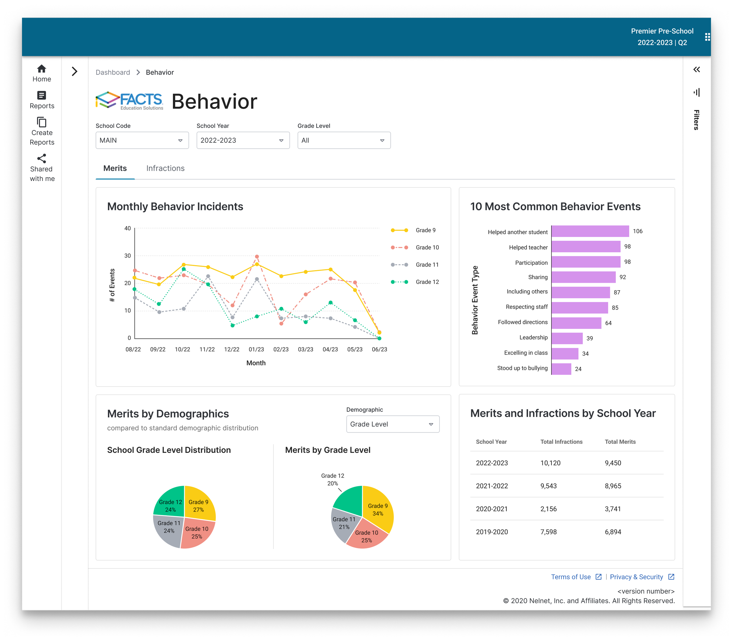
Merits Dashboard
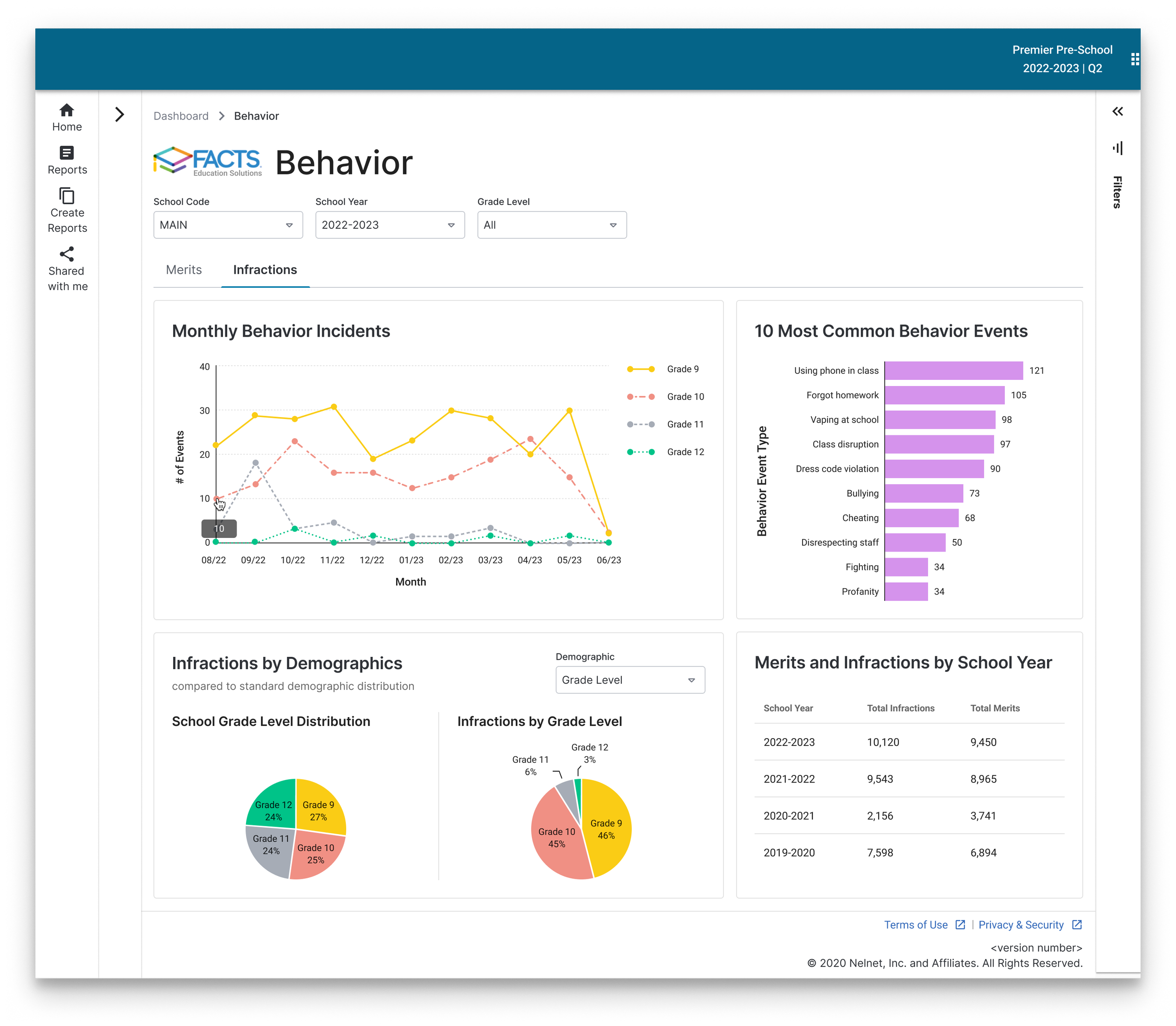
Infractions Dashboard