Project 1: Taming Complexity
My role: I was the lead designer on our biggest key revenue initiative of 2024-2026. The previous scheduling software was designed in the late 90s/early 2000s, and has been a big point of contention with our users — losing our business a number of sales as a result. My job was to reimagine it, working closely with our users to create a scheduling system competitive enough to make the sales department drool.
Audience: School administrators and registrars
Goal: Convert our existing Courses and Class Sections areas from ColdFusion to Angular, making the page more user friendly and adding desired features in the process.
Notes: This was Phase 3 of our Scheduling redesign project, a complete revamp of our very large Scheduling area.
Initial Feedback
While I always try to understand existing user wants going into a project, this was the first time I gathered such large-scale pre-project feedback. With the help of our Pendo content team, we released an in-app survey asking for user likes, dislikes, and wants for the existing Courses and Class Sections pages.
The survey was a massive success — garnering over 150 responses in three days.
I then cleaned up the data and took some of the best pieces of feedback (along with product team requests) and created a card sorting board that inspired the flow of the rest of the project. Pushing this redesign to be one of our most user-involved yet.

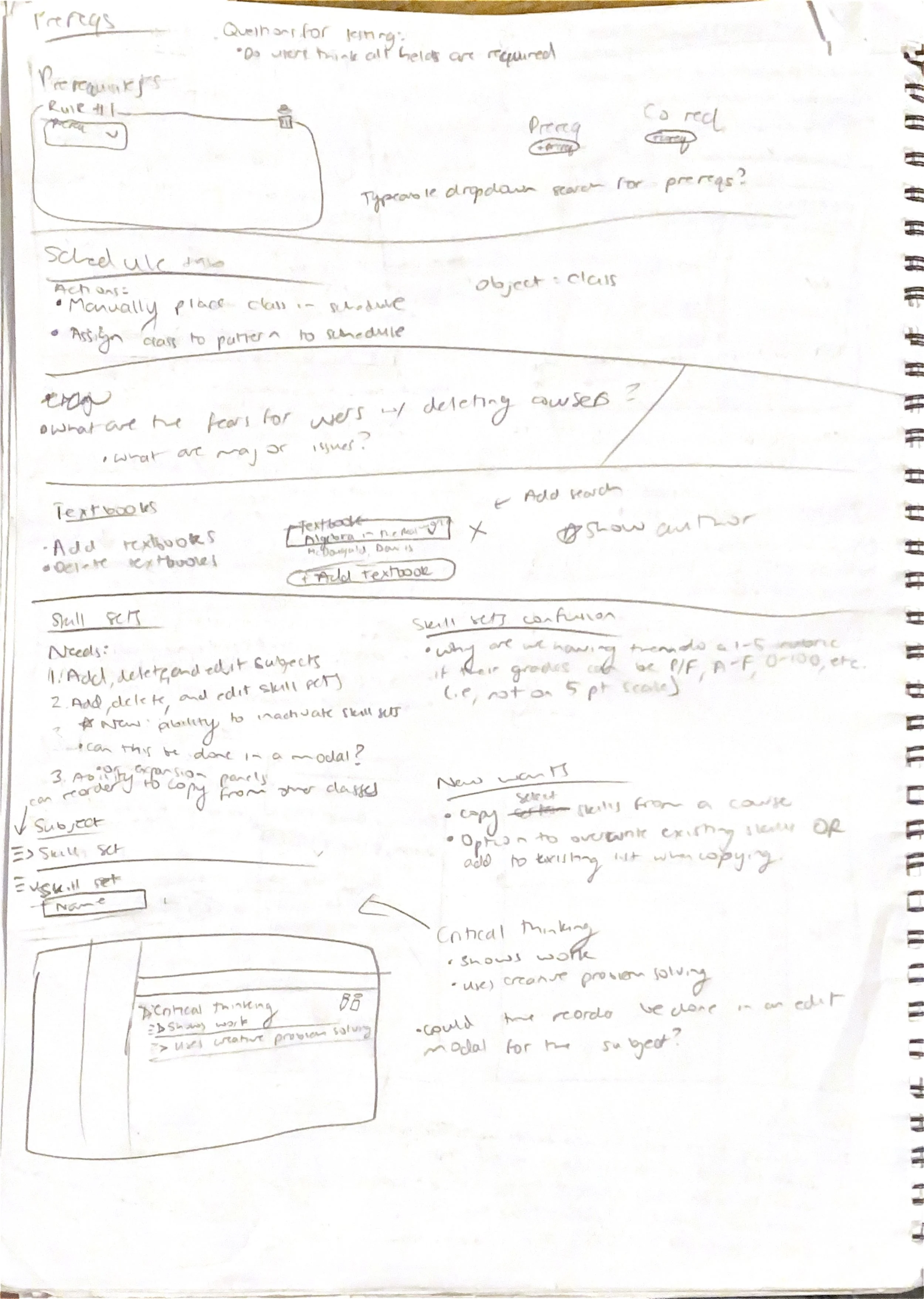
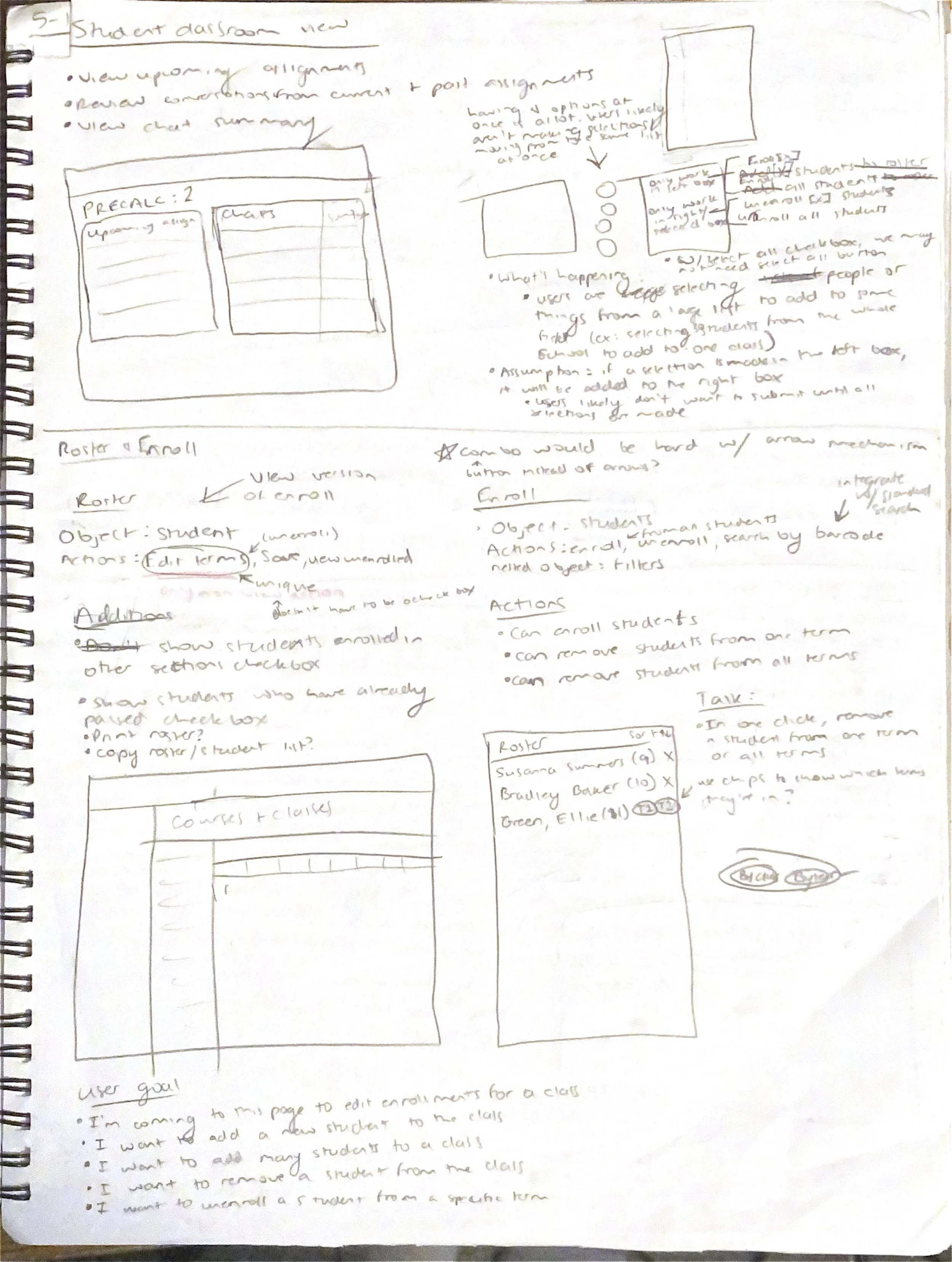
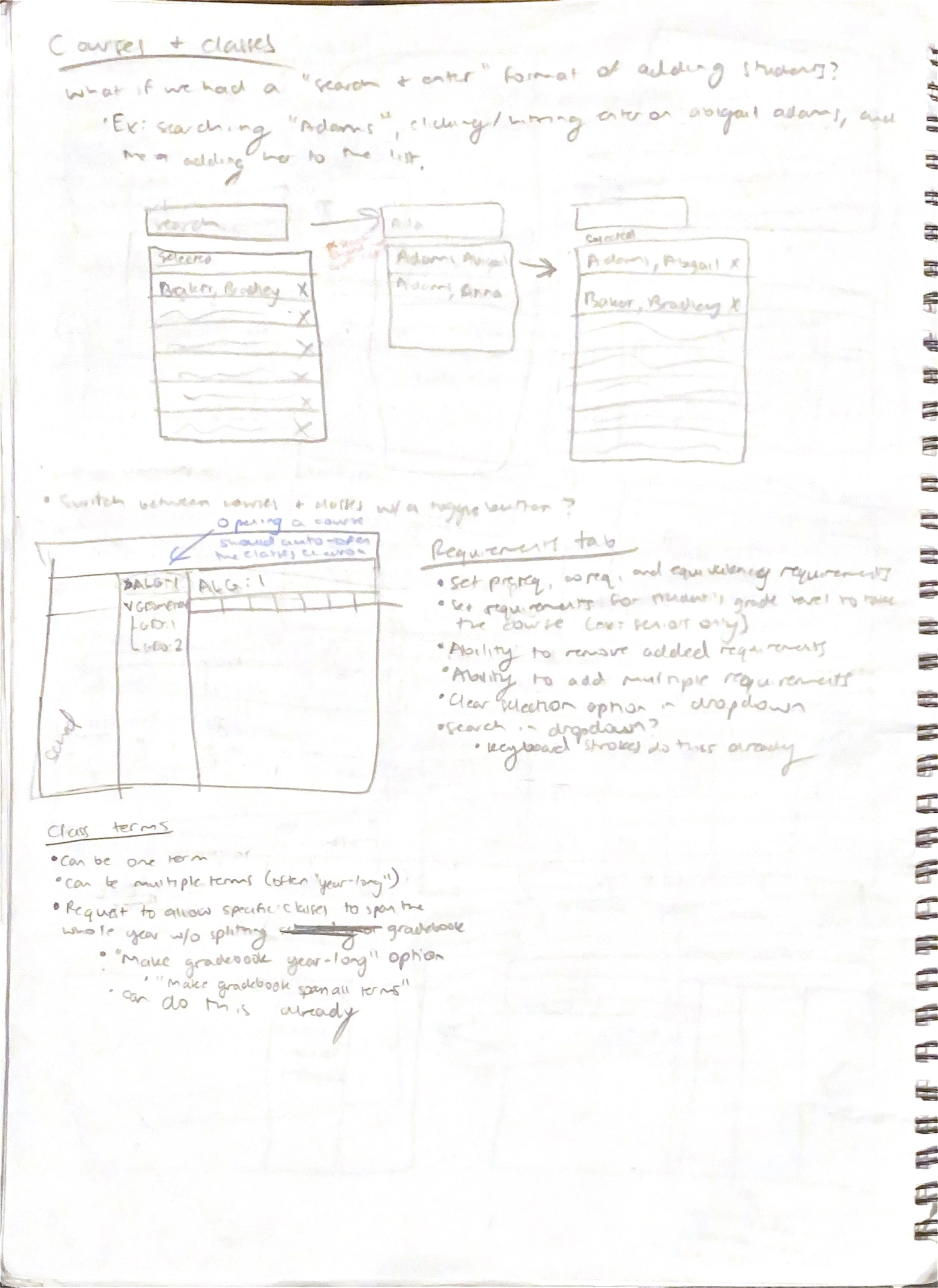
Sketches
When it comes to design ideation, I am a big paper and pencil person. I began sketching out my ideas, taking lots of notes and documenting my thoughts along the way.
Unconfusing the Navigation
The previous system split the Courses and Classes pages up into two separate areas. The language also consistently confused our users because “Courses” and “Classes” sound like the same thing in conversation. The previous system also used buttons to take the user to each section of the new page, which felt like a very “broken” way of navigating. Finally, each screen needed a bit of a facelift, some wording or organization changes, and new features that our users craved.
Need: A cohesive layout that brings the Courses and Classes areas together and makes it clear what the differences between the two are.
Solution: Rebrand “Classes” to “Class Sections” to make it clearer what they are (individual instances of the course that have set rosters, a time of day, and an assigned instructor). Bring Courses and Class Sections together into one left navigation, with the course becoming an accordion that contains each of its class sections.
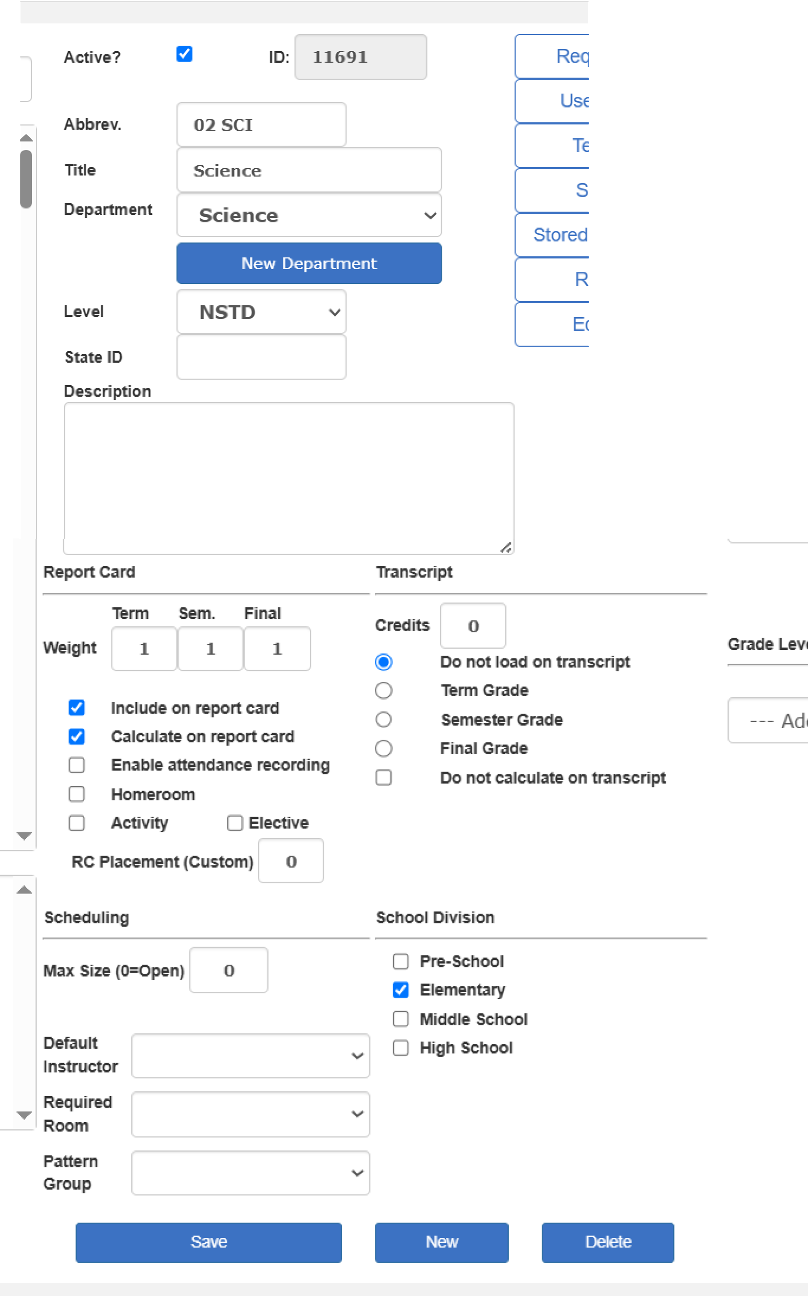
Previous system
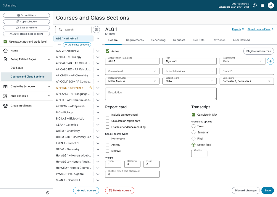
New system
Giving the People What They Want!
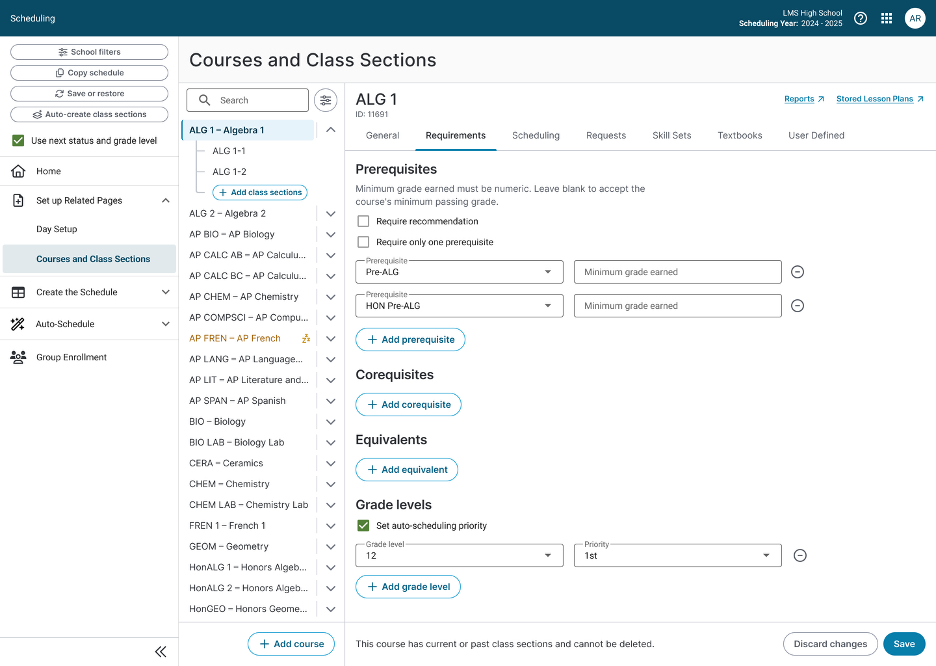
Our users craved improvements to the scheduling system that were almost basic necessities for school scheduling that we had been lacking for years. One of those major requests was the ability to have more customization with setting up the requirements for a student to take a course.
Need: The ability to set a minimum required grade from a prerequisite course to take the next level course. The ability to treat prerequisites as “and/or” instead of all or nothing (current functionality). The ability to set an enrollment priority based on grade level for the auto-scheduler.
Solution: I implemented all of these user requests into my design, thinking of the user and their disdain for multiple clicks the entire time. I simplified the product owner’s request for a “3 click” minimum grade flow (one click to enable minimum grade, one to choose alpha or numeric grades, one to enter the input box for the minimum grade) into just one click: a simple input box that only takes numeric grades (I had a one-click flow designed for alpha or numeric, but dev constraints dictated the grades had to be numeric). If left blank, our system knows the user isn’t using a minimum grade earned, and just looks for a passing grade.
Conclusion
The biggest takeaway from our demos was also the simplest: combining Courses and Class Sections into one flow made the whole experience dramatically easier to understand. Users were thrilled to find everything in one central place instead of jumping between disconnected pages, saving them the time and mental energy the old system constantly cost them.
The features I designed for this phase also were direct solutions to the reason we’d been losing customers in the first place. Some of our schools are currently paying third-party vendors to cover basic things that our software couldn’t do. Things like “and/or” logic on prerequisites, requiring a minimum grade for prereq courses, and letting students re-request a course they’d already taken.
Closing those gaps gives schools a reason to drop the outside vendors and run everything through us. After years of watching this area cost us business, the sales team finally has a scheduling system worth drooling over.
The project recently shipped. It’s the farthest-reaching phase of our scheduling overhaul yet, and a real step towards a product schools want to stay with.