Project 3: Including Accessibility
My role: I designed a suite of data visualization dashboards from the ground up, giving school administrators a digestible way to understand their students’ behavior patterns. Data visualization leans heavily on color to carry meaning, which makes it a real accessibility problem. If a chart only works when you can tell the colors apart, it doesn’t work for colorblind users at all. Designing these dashboards meant solving for that from the start.
Audience: School administrators
Goal: To provide our users with visual representations of their school’s behavior data for reporting and other administrative needs.
Notes: The dashboards are being created in Power BI — an entirely new tool for everyone on the project with its own unique design constraints.
Initial Discussion & Sketch
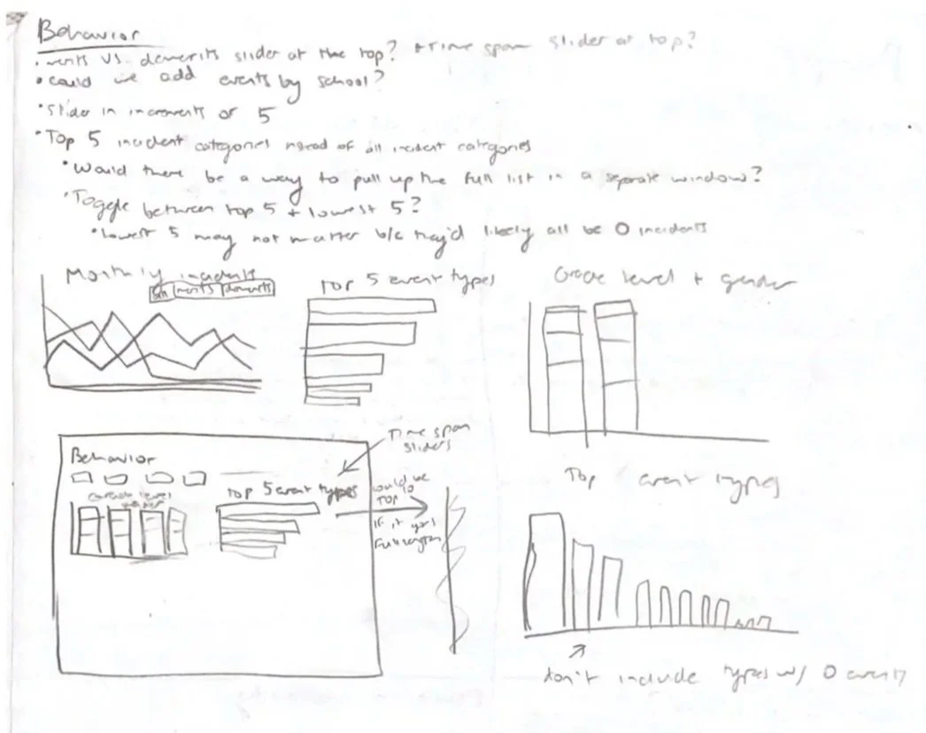
After receiving the project goal from my product owner, I got to work drafting up a series of data visualizations that would best achieve this goal. Many visualizations were also directly requested by the product owner.
Need: I realized that our system recorded two different types of behavior events: merits and demerits. If we included both of these when reporting on behavior “incidents” (which is connotatively associated with negative events), the data would be skewed by the positive events.
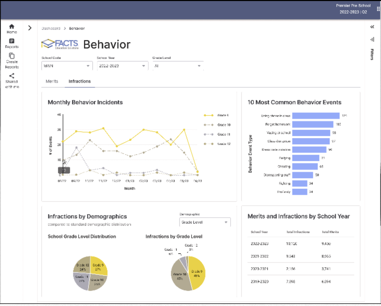
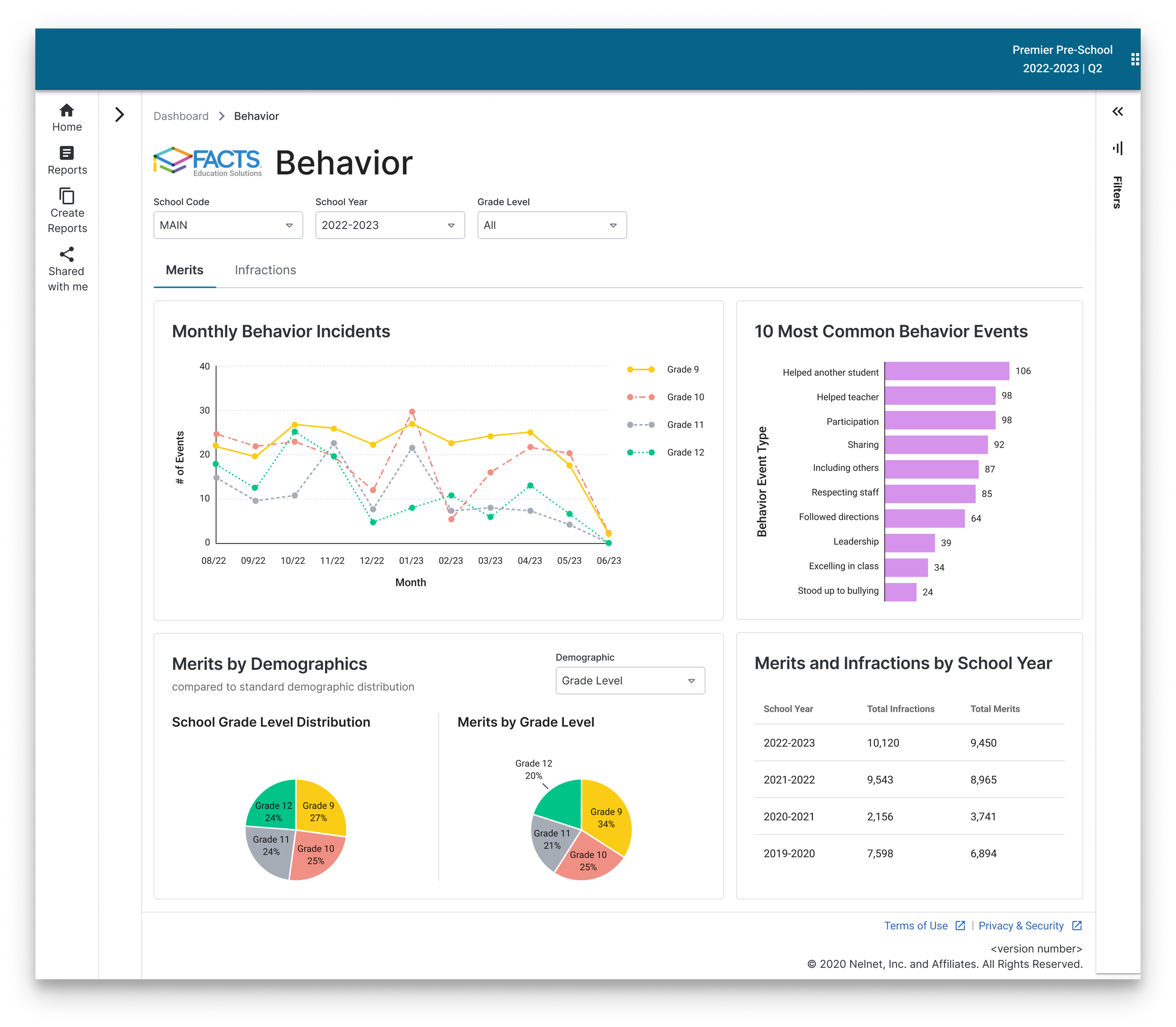
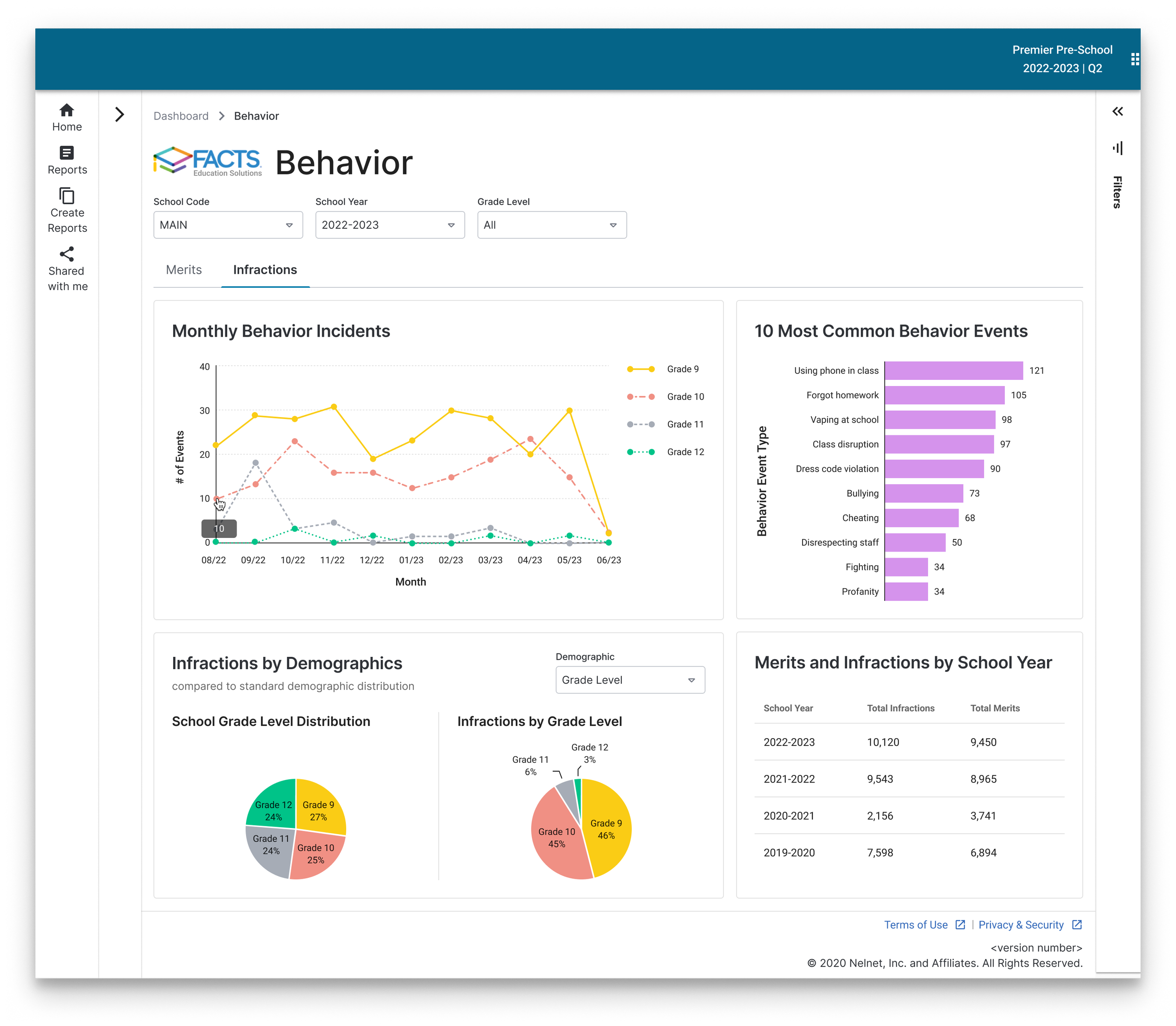
Solution: Separate merit and demerit data (later renamed to “infractions”) via tabs in at the top of the dashboard.
Designing for Accessibility
A passion of mine is digital accessibility. It was important to me that our data visualizations were meaningful to all users, especially when many charts and graphs are not made with colorblind people in mind. I kept color distinctions because they are extremely helpful to color-sighted users, but I also took the following measures to ensure information wasn’t conveyed by color alone:
Labels were added directly to the pie charts to remove the use of a color-dependent legend.
White lines were added between pie chart wedges to clearly separate them and prevent colors from “blurring.” This is also helps prevent eye strain for all users after staring at the page for an extended period of time.
The line graph uses patterns so the legend was not entirely color-dependent and is still visually distinguishable to a colorblind user.
Behavior Dashboard in red-green colorblindness view. Generated by COBLIS (Color Blindness Simulator)
Final Dashboards
Conclusion
None of these were big, flashy choices. They were small, deliberate ones. The kind that decide whether a chart actually works for the person reading it, or just looks like it does. And behavior data is high-stakes for a school. The administrators reading it deserve charts that work the first time, even if they don’t see color the same way I do. That’s how I approach data visualization by default. Accessibility isn’t a pass I make at the end — it’s the constraint I design with.